John Slade Ely House Art Exhibit
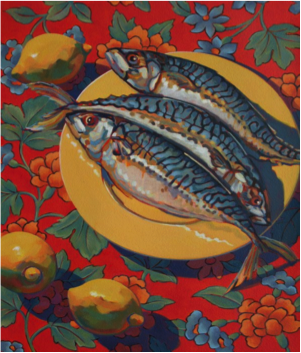

Mackerel With Lemon
Colin: Meh boring
This was Colin’s initial feedback upon looking at the first piece of artwork. He stared at it for a few seconds before shrugging his shoulders and tilting his head to the side, letting me know that he was unimpressed.
Nicole: You have to have more of an opinion than that on the painting. What else do you think about it?
Colin: Its just too bland.
Out of all of the things he could have said about the painting- from “the lines aren’t straight” to “ it isn’t realistic enough”- I did not expect the feedback that it was too bland.
Nicole: All right so what makes this painting so “boring”?
Colin took another glance at the painting, squinted his eyes, and then told me that he thought the color scheme was unattractive. He found the colors that the artist used to be very dark, earthy tones, that didn’t compliment the piece. I kept to myself, the thought that perhaps the artist intended upon making the piece earthy and flat, which is actually very popular in pieces that will be used to decorate homes.
Colin: It’s unexciting, lacking in creative talent, and extremely boring to look at.
What surprises him the most is the entire background and how badly it matches the rest of the painting. He especially wonders why the artist used colors in the background that match with the figure in the forefront. He wants to know why the artist put so much detail into a background that just blended with the main focus piece, the fish, to the point where it became almost unnoticeable. And why the painter made the lemons in the background the same color as the plate right next to them?
Colin: Do you like it?
Nicole: Not really.
When told to give a complete summary of his thoughts on the first painting, he concluded that it might look nice as a tablecloth design but does not belong in a fine art exhibit.
Colin: Why couldn’t the artist have added in more detail? Added in more color? He should have made it more exciting.
One down, three to go…
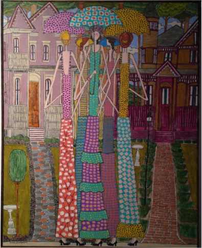
Hannah Talking to the Girls on a Summer Day
Colin was clearly done with “Mackerel With Lemon” so he started walking over to the next piece of art on the wall.
Colin: Come look at this one!
He seemed to like the next piece and was eager to show me what it was.
He was a lot more interested in this one, and his commentary was much more descriptive.
Colin: It’s so unique. I’ve never seen anything like it.
As we continue to look up at the vibrant acrylic drawing, Colin becomes increasingly amused.
Colin: It’s definitely eye catching, isn’t it? I mean, the colors are so bright and the picture is very cartoonish. Why didn’t the artist draw it normally instead of stretching it out to be super tall?
He is very impressed by the creative ability strewn into this piece and particularly, with the playful style that the artist incorporated. He is exceptionally drawn to the Victorian style houses in the background, with their elongated frames and detailed furnishings.
As part two comes to a close, I ask Colin to sum up.
Colin: It’s much better than the fish on a plate. It reminds me of a cartoon show set in New Haven. It’s very colorful and interesting to look at because there is so much going on in the piece. The houses that the artist drew were the best part.
Nicole: But they weren’t even the main focal point of the drawing
Colin: So?
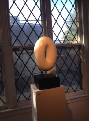
Anahata
I started to move onto the next piece, for a head start, and Colin soon followed along. I’m not sure what to think about this one and can’t imagine what Colin’s going to have to say about it.
It takes him a little while to appreciate the sculpture’s artistic ability and craftsmanship. The piece, which was sculpted from marble, is perfectly rounded and smooth to the touch.
Colin: Incredible! It’s so simple but very artsy at the same time. I bet the artist put a ton of work into that.
Colin really took to the symbolic title of the piece, “Anahata”, which is known as the Buddhists heart chakra. He found the sculpture to be representative of the concept of the unity between the different chakras in the body due to the circular structure of the piece. The artists sneaky yet genius reference left Colin impressed.
Colin: I feel like this is very contemporary and modern. Couldn’t you see this in the office of a famous Fashion designer?
Nicole: Yea, I totally get what you’re saying.
Colin: Ok good. It’s very elegant.
It’s then that Colin decides to take some pictures of the statue since he likes it so much.
Colin is absorbed. He finds this piece to be the most notable out of all that we have seen so far.
By the time part three comes to an end, Colin was more excited about the experiment. Now that he found something he could connect with, he feels there may be a strong possibility that the rest of the art exhibit holds promising works for him to find. He finishes inspecting “Anahata” with a comical comment.
Colin: It actually kind of looks like a donut.
Fierce
Colin made us continue on to the next piece. He was probably eager to see what the next frame had in store for us or he could have just wanted to finish the review as quickly as possible.
The artistic talent displayed in the artwork inspires Colin even further. This next piece is a portrait with such attention to detail and realistic attributes. It left Colin- mouth agape-, like he had just discovered the ability to time travel.
Colin: I don’t understand how someone can make his or her art so life-like that it almost looks like a picture. This is high quality work. I didn’t expect art this well composed to be in a small art exhibit like this place.
Colin is surprised with the artists’ ability to create something so visually realistic. He is shocked by the contouring of the face and the shadows that create the look of her collarbones. He is very impressed with the sophisticated feel of the art exhibit and the pieces being displayed. I make a commentary note to Colin, that the artists have a lot of experience and put a lot of time into their work. I also add that the John Slade Ely House is pretty selective in the pieces they choose to put in their exhibits.
Colin: This looks like it belongs in the Metropolitan Museum. I’m serious.
When we step back for a last glance at “Fierce”, Colin becomes grateful that the review process is almost over.
Colin: Her eyes are really piercing. That’s probably why the artist named it “Fierce”.
Colin gave his final feedback on the drawing with a drawn out, “ wow”, either because he’s still surprised about the realistic aspects of the drawing or he’s reflecting on the review process.
The Overall Score
After asking Colin to score the four paintings, first individually, and then collectively, he is quick to shout out numbers.
Colin: Okay, the first one gets a 3/10, the second a 6/10, the sculpture is an 8/10, and the last one-hmm- a 5/10. But overall, I’m giving the exhibit a 7/10.
By the nodding of my head, he could tell that I also complied with giving the John Slade Ely House Art Exhibit a 7/10.
Colin: So you agree? You don’t think I was too generous with a 7?
Nicole: No I think a seven is a perfect score for this place.
Colin: I’m glad we agree.
Colin seems contempt with his job done as an art critic for this review.
He then goes onto say that the exhibit was nice, with a lot of great artwork, but there were more average pieces than extraordinary pieces. He wanted more unique artwork and variation in the types of art that were displayed. He did like viewing the paintings and drawings but thought that they should have mixed it up with more statues and sculptures, like the third piece we looked at.
Colin: Meh boring
This was Colin’s initial feedback upon looking at the first piece of artwork. He stared at it for a few seconds before shrugging his shoulders and tilting his head to the side, letting me know that he was unimpressed.
Nicole: You have to have more of an opinion than that on the painting. What else do you think about it?
Colin: Its just too bland.
Out of all of the things he could have said about the painting- from “the lines aren’t straight” to “ it isn’t realistic enough”- I did not expect the feedback that it was too bland.
Nicole: All right so what makes this painting so “boring”?
Colin took another glance at the painting, squinted his eyes, and then told me that he thought the color scheme was unattractive. He found the colors that the artist used to be very dark, earthy tones, that didn’t compliment the piece. I kept to myself, the thought that perhaps the artist intended upon making the piece earthy and flat, which is actually very popular in pieces that will be used to decorate homes.
Colin: It’s unexciting, lacking in creative talent, and extremely boring to look at.
What surprises him the most is the entire background and how badly it matches the rest of the painting. He especially wonders why the artist used colors in the background that match with the figure in the forefront. He wants to know why the artist put so much detail into a background that just blended with the main focus piece, the fish, to the point where it became almost unnoticeable. And why the painter made the lemons in the background the same color as the plate right next to them?
Colin: Do you like it?
Nicole: Not really.
When told to give a complete summary of his thoughts on the first painting, he concluded that it might look nice as a tablecloth design but does not belong in a fine art exhibit.
Colin: Why couldn’t the artist have added in more detail? Added in more color? He should have made it more exciting.
One down, three to go…
Hannah Talking to the Girls on a Summer Day
Colin was clearly done with “Mackerel With Lemon” so he started walking over to the next piece of art on the wall.
Colin: Come look at this one!
He seemed to like the next piece and was eager to show me what it was.
He was a lot more interested in this one, and his commentary was much more descriptive.
Colin: It’s so unique. I’ve never seen anything like it.
As we continue to look up at the vibrant acrylic drawing, Colin becomes increasingly amused.
Colin: It’s definitely eye catching, isn’t it? I mean, the colors are so bright and the picture is very cartoonish. Why didn’t the artist draw it normally instead of stretching it out to be super tall?
He is very impressed by the creative ability strewn into this piece and particularly, with the playful style that the artist incorporated. He is exceptionally drawn to the Victorian style houses in the background, with their elongated frames and detailed furnishings.
As part two comes to a close, I ask Colin to sum up.
Colin: It’s much better than the fish on a plate. It reminds me of a cartoon show set in New Haven. It’s very colorful and interesting to look at because there is so much going on in the piece. The houses that the artist drew were the best part.
Nicole: But they weren’t even the main focal point of the drawing
Colin: So?
Anahata
I started to move onto the next piece, for a head start, and Colin soon followed along. I’m not sure what to think about this one and can’t imagine what Colin’s going to have to say about it.
It takes him a little while to appreciate the sculpture’s artistic ability and craftsmanship. The piece, which was sculpted from marble, is perfectly rounded and smooth to the touch.
Colin: Incredible! It’s so simple but very artsy at the same time. I bet the artist put a ton of work into that.
Colin really took to the symbolic title of the piece, “Anahata”, which is known as the Buddhists heart chakra. He found the sculpture to be representative of the concept of the unity between the different chakras in the body due to the circular structure of the piece. The artists sneaky yet genius reference left Colin impressed.
Colin: I feel like this is very contemporary and modern. Couldn’t you see this in the office of a famous Fashion designer?
Nicole: Yea, I totally get what you’re saying.
Colin: Ok good. It’s very elegant.
It’s then that Colin decides to take some pictures of the statue since he likes it so much.
Colin is absorbed. He finds this piece to be the most notable out of all that we have seen so far.
By the time part three comes to an end, Colin was more excited about the experiment. Now that he found something he could connect with, he feels there may be a strong possibility that the rest of the art exhibit holds promising works for him to find. He finishes inspecting “Anahata” with a comical comment.
Colin: It actually kind of looks like a donut.
Fierce
Colin made us continue on to the next piece. He was probably eager to see what the next frame had in store for us or he could have just wanted to finish the review as quickly as possible.
The artistic talent displayed in the artwork inspires Colin even further. This next piece is a portrait with such attention to detail and realistic attributes. It left Colin- mouth agape-, like he had just discovered the ability to time travel.
Colin: I don’t understand how someone can make his or her art so life-like that it almost looks like a picture. This is high quality work. I didn’t expect art this well composed to be in a small art exhibit like this place.
Colin is surprised with the artists’ ability to create something so visually realistic. He is shocked by the contouring of the face and the shadows that create the look of her collarbones. He is very impressed with the sophisticated feel of the art exhibit and the pieces being displayed. I make a commentary note to Colin, that the artists have a lot of experience and put a lot of time into their work. I also add that the John Slade Ely House is pretty selective in the pieces they choose to put in their exhibits.
Colin: This looks like it belongs in the Metropolitan Museum. I’m serious.
When we step back for a last glance at “Fierce”, Colin becomes grateful that the review process is almost over.
Colin: Her eyes are really piercing. That’s probably why the artist named it “Fierce”.
Colin gave his final feedback on the drawing with a drawn out, “ wow”, either because he’s still surprised about the realistic aspects of the drawing or he’s reflecting on the review process.
The Overall Score
After asking Colin to score the four paintings, first individually, and then collectively, he is quick to shout out numbers.
Colin: Okay, the first one gets a 3/10, the second a 6/10, the sculpture is an 8/10, and the last one-hmm- a 5/10. But overall, I’m giving the exhibit a 7/10.
By the nodding of my head, he could tell that I also complied with giving the John Slade Ely House Art Exhibit a 7/10.
Colin: So you agree? You don’t think I was too generous with a 7?
Nicole: No I think a seven is a perfect score for this place.
Colin: I’m glad we agree.
Colin seems contempt with his job done as an art critic for this review.
He then goes onto say that the exhibit was nice, with a lot of great artwork, but there were more average pieces than extraordinary pieces. He wanted more unique artwork and variation in the types of art that were displayed. He did like viewing the paintings and drawings but thought that they should have mixed it up with more statues and sculptures, like the third piece we looked at.